Thursday 27 February 2020

Advertising key conventions


1) What key conventions of an advert can you find and what are the connotations of each one?

The key conventions of an advert I can find is the simple colour scheme. The colour is a very light lilac colour which connotes a first love which is your mum. Another key conventions I can see is the slogan, "mother's day is better with cake". This connotes that you should treat your mum on valentines day with something sweet. The simple image of the cake connotes that one small cake is still delicious. The last conventions I see is the name of the programme, "Mr Kipling" which is a brand of cakes and baked goods marketed in the UK and Ireland. This connotes that whenever its mother's day you should buy Mr Kipling's cakes as it will bring happiness.

3) What is the USP (unique selling point) of the product and how do you know?

The USP of the product is the slogan, " exceedingly good cakes". I know this because when the consumers view this text, they'll end up buying more of Mr Kipling's cake, not only for mother's day buy also more frequently. 

Extension task:

1) A clear brand identity:


2) A shocking or controversial idea:


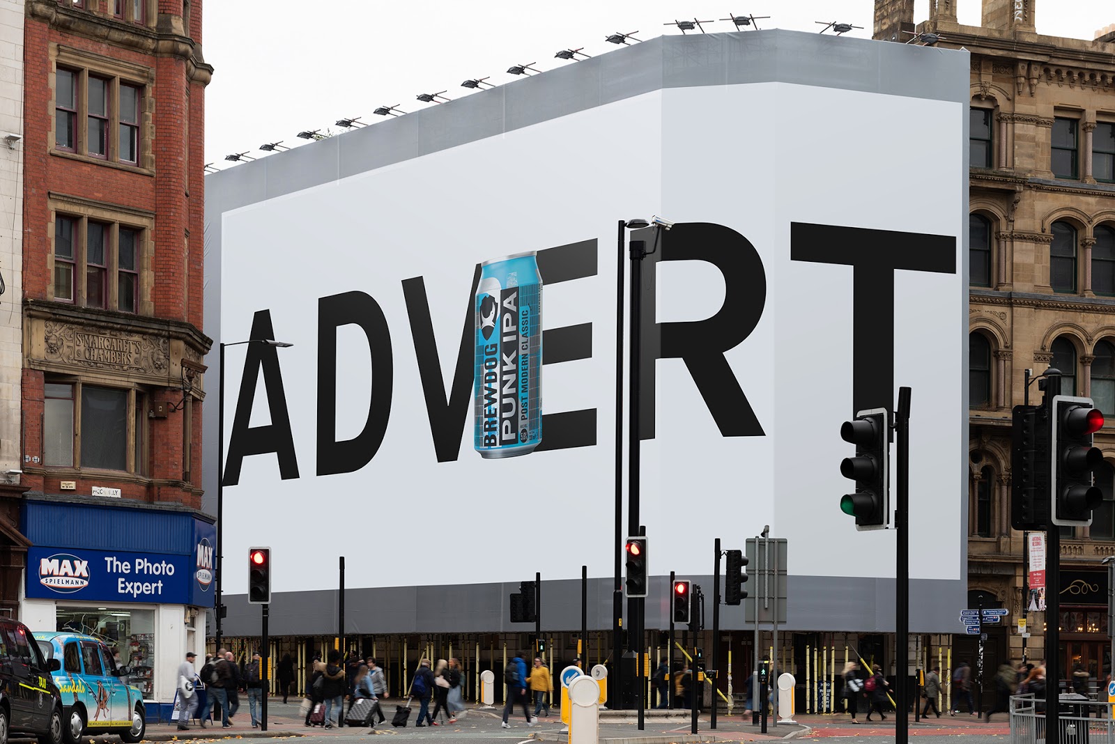
3) An emotional connection to audience:


4) An innovative or ‘different’, subversive concept (e.g the porcupine advertising VW car):


5) A foreign advert that you can understand despite the language barrier:


Finally, write what the USP is for each advert:

The USP for the clear brand identity is that its a very simple advert. The slogan ''I'm lovin' it'' shows that people who eat McDonald's love eating their food. The red in the background connotes love, energy and strength- which sows once you eat their food it'll change your whole mood. The USP for the shocking/controversial advert is that when you use this Dove product, you'll have a different skin colour. This is a very offensive advert as it downgrades the women who has a darker skin colour. This advert, from the 21st century, just shows how people never change and that they are stuck in a different time zone. The USP for the emotional advert is that the company wants us, the audience, to feel bad for the young child and donate money. The slogan ''he's starving. we're not. its time to share'' shows that they want us to help them as they are more unfortunate than us. The text in blue connotes serenity and reflection. The USP for the innovative subversive concept is that they are catching peoples attention to the word 'advert', so that the drink can be the main focus. The text is in the font black and is in bold. This is very eye-catching and conspicuous. Lastly, the USP for the foreign advert distinctly shows that you should buy a beer after a long day of working. This shows that the man has been working and the women, which stereotype is believed to be a house wife and being inferior towards her husband, to be poring a glass of beer for her husband, The red in the background connotes strength which means the husband will be strengthened once he drinks the beer, and love which shows the wife loves her husband as she's pouring him a drink.

Magazines assessment learner response

1) Type up your feedback in full (you don't need to write the mark and grade if you want to keep this confidential).                                                                                                                                                                                                                                                   Grade= 4-  
WWW:able to identify magazine conventions and the social and cultural values! 
EBI:for question 2, you should pick 2-3 aspects of the front cover that you can analyse well- the masthead typography for example. 
For question 3, your vocab needed to be more sophisticated.

2) Read the mark scheme for this assessment carefully. Write down the mark you achieved for each question:

Q1: 2/2
Q2: 4/12
Q3: 4/8


4) Look specifically at question 2 - pick out three points from the mark scheme that you didn't include in your analysis of the unseen Grazia magazine cover.


I didn't include straightforward aspects of how design and layout are used, consistent appropriate and effective use of subject specific terminology throughout and excellent analysis of the product that is detailed and critically engages with the nuanced aspects of how design and layout are used.

5) Now look at question 3. Use the mark scheme to identify three points you could have made regarding how Tatler reflects British social and cultural values.


The three points I could of made was the theoretical framework, including in relation to social and cultural contexts with accurate references to the CSP, the product that is clear and generally engages with aspects of social and cultural values communicated by the CSP and social and cultural contexts with detailed and accurate references to the CSP.

Monday 10 February 2020

Reveal: case study blog task

Media language:

1) How many of the 12 magazine cover key conventions feature on this edition of Reveal? List them with specific reference to the convention on the CSP edition of Reveal.


The 12 magazine cover key conventions feature on this edition of Reveal is the mast head, cover price, cover lines, screamers, main flash and cover images.


2) What is the font choice used on the cover and what does this choice connote? 


The font choice used on the cover is sans serif to connote that the magazine is up to date.

3) How do the cover lines appeal to the Reveal target audience?

The cover lines appeal to the Reveal target audience by showing us that they have the latest gossip some people want to hear.

4) What are the connotations of the Reveal colour scheme on this particular front cover?

The colours red, pink, yellow and green connote the target audience are mostly female.

5) How are images used to create interest in the magazine? Find three reasons for your answer. (E.g. mise-en-scene such as props, costume and make-up, body position, facial expression).

The images in this magazine are used to create interest by the paparazzi photos. A couple reasons for this is so that people would think they are ordinary people going about their lives.

6) What differences can you find between the use of design and typography between Tatler and Reveal? List at least three and explain the effect on audiences.

The differences between the use of design and typography between Tatler and Reveal is that Tatler is a more posh and elegant magazine. This is because they use Serif for their typography and Reveal use Sans Serif which is more laid back.

Representations:

1) What type of celebrities appear on the front cover? How are they represented in Reveal? (Positive? Negative? Reinforcing or challenging stereotypes?)

The type of celebrities that appear on the front cover are well known, famous people.

2) How are women represented on the cover of Reveal? Think about both images and cover lines here.

Women are represented as people who should be pregnant and find new lovers. And also, that all women should be working out to have that 'nice' body. 

3) How do Reveal and Tatler represent social class? (E.g. middle/upper class and working class)

Tatler represent social class as only wealthy people should read about other people's lives. Reveal represents it as anyone could read it.

4) What would be the preferred and oppositional readings to this cover of Reveal?

The preferred readings is that they want the audience to think that the celebrities are bad people. The oppositional readings is that they are being viewed as people they aren't.

Social and cultural context:

1) What aspects of British life are reflected in Reveal? How does this compare to Tatler?

The aspects of British life represented on Reveal is pregnancy, motherhood, marriage, diets, and relationships. For Tatler it's jewels, makeup and expensive stuff.


2) What do the cover lines in Reveal suggest about the issues and lifestyle of Reveal readers?


The cover lines in Reveal suggest that the Reveal readers is that people go through some of the stuff Reveal put as their cover lines. Such as pregnancies, wanting too lose weight and drama- family wise.


3) Find three other front covers for Reveal. What issues or features regularly appear in Reveal? 


Issues and features that regularly appear in Reveal are celebrity struggles and interference between people's love lifes.